Color Psychology in Interior Design: Transforming Spaces with Feeling

Today’s chosen theme: Color Psychology in Interior Design. Discover how hues shape mood, behavior, and identity at home—and learn to design rooms that feel as good as they look. Subscribe for weekly color stories, practical tips, and inspiring real-life makeovers.

Foundations of Color Psychology

Color influences our nervous system through associations and perception. Warm hues can quicken the pulse, cool tones can slow it, and balanced palettes create calm. Understanding these responses helps you match wall colors to well-being goals instead of chasing fleeting trends.

Foundations of Color Psychology

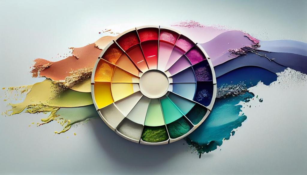
Not all reds are equal, and not all blues are soothing. Lower saturation and higher value soften intensity, while contrast directs attention. Adjust these three variables first, and you can shape space dramatically without changing the actual hue family.

Warm vs. Cool Palettes at Home

Use warm hues to encourage conversation and activity in social spaces. Temper cherry reds with earthy terracotta, or punchy yellows with creamy whites. Avoid over-saturation in small rooms to prevent visual fatigue and overstimulation during long evenings at home.

Warm vs. Cool Palettes at Home

Blue slows the breath; green restores attention. Choose softened, grayed versions to avoid a clinical chill. Layer natural materials—linen, rattan, oak—to keep cool rooms tactile and welcoming, especially in bedrooms or reading corners where calm is the primary goal.

Bedroom Serenity: Restful Tints and Tranquil Transitions

Think misty blue, muted sage, or lavender gray for deeper sleep and softer evenings. Keep contrasts low between wall, ceiling, and trim for a cocooning effect. Add warm bedside light to counter nighttime coolness and encourage winding down without screens.

Kitchen and Dining: Appetite, Conversation, and Warmth

Soft terracotta backsplashes and honeyed wood tones make meals feel generous. If you prefer fresh mornings, introduce leafy green accents for vitality. Keep high-chroma colors on smaller surfaces—bar stools, artwork—so you can edit easily as tastes evolve.

Home Office: Focus without Burnout

Choose desaturated blues or blue-greens that enhance sustained attention. Limit strong red accents to small accessories, not full walls. Place a deeper hue behind your monitor to reduce glare, and bring plants into peripheral view to support gentle mental restoration.
Cultural Lenses That Reframe Palettes
Red may signal luck, passion, or warning depending on context; white can mean purity or mourning. Research local symbolism before finalizing a bold scheme. Incorporating respectful nods to heritage strengthens identity while keeping rooms emotionally coherent and meaningful.
Memory, Scent, and Color: Your Unique Palette
A childhood beach may make pale aqua your comfort color; a grandparent’s baking might anchor you to buttercream enamel. Map your happiest memories, then translate them into tones, textures, and finishes that renew those feelings each day at home.
Co-Creating Color with Family or Roommates
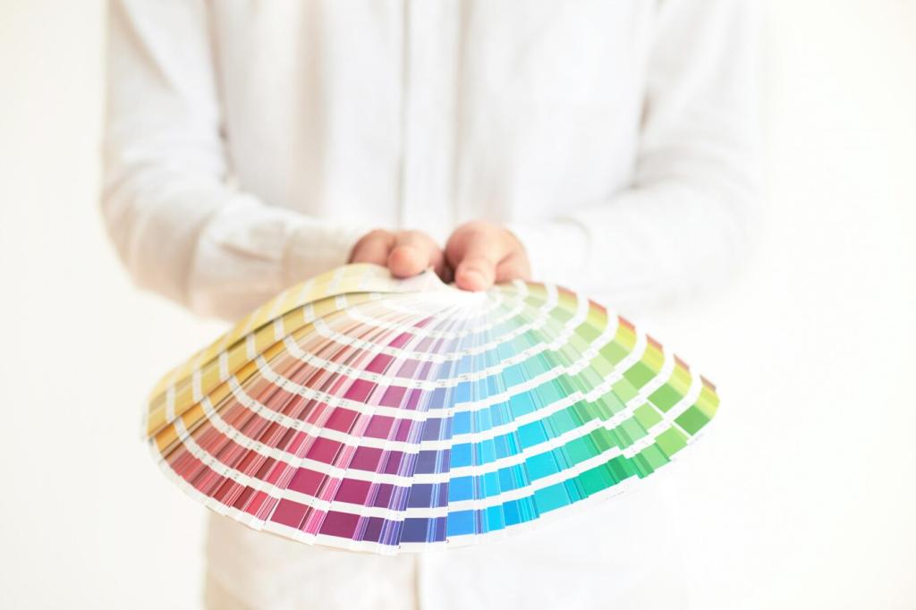
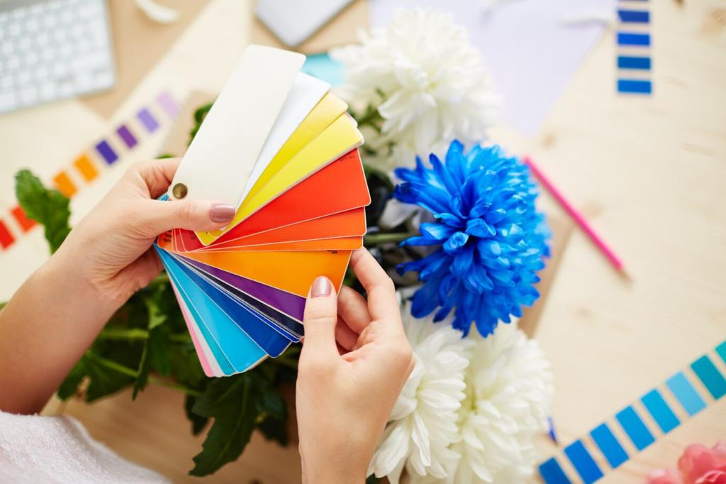
Gather swatches everyone loves, find overlaps, and give each person an accent zone. Use shared neutrals as a peace treaty. This collaborative approach reduces decision fatigue and builds ownership, making maintenance and seasonal updates easier and more joyful.

Light, Materials, and Perception

North light cools colors; south light warms them. Warm-white bulbs cozy up cooler palettes, while daylight bulbs keep clarity for tasks. Mix sources—ambient, task, accent—to avoid flat color, and test bulbs alongside swatches at multiple times of day.

Light, Materials, and Perception

Finish affects perceived depth. Matte softens and hides imperfections; satin brings gentle sheen and durability; gloss heightens drama but shows flaws. Pair finish with function and architecture so the surface quality amplifies the intended emotional atmosphere.

Stories from Real Homes

Maya swapped stark white for a whisper of blue-gray and pale oatmeal trim. The result felt taller, calmer, and brighter. She kept a coral throw as a cheerful accent, proving subtle shifts can deliver spaciousness without sacrificing personality or warmth.

Stories from Real Homes

A 1920s bungalow regained charm through heritage greens and cream wainscoting. Saturation dropped slightly to suit modern lighting. The palette honored original details while creating a resilient, family-friendly backdrop for art, books, and everyday gatherings around the dining table.
Outerformpartners
Privacy Overview

This website uses cookies so that we can provide you with the best user experience possible. Cookie information is stored in your browser and performs functions such as recognising you when you return to our website and helping our team to understand which sections of the website you find most interesting and useful.