Creating Ambiance with Furniture Colors: Today’s Chosen Theme

Step into a room where color sets the mood and every chair, sofa, and cabinet sings in harmony. Today’s chosen theme is “Creating Ambiance with Furniture Colors”—a friendly guide to shaping feeling, flow, and focus using palettes, finishes, and thoughtful placement. Read on, ask questions in the comments, and subscribe if you want deeper dives into mood-driven design.

Warm vs. Cool Hues

Warm-toned sofas in terracotta, mustard, or rust can make a room feel two degrees warmer psychologically, encouraging conversation and lingering. Cooler furniture hues like slate, teal, or misty blue promote calm, clarity, and a gentle sense of spacious breathing.

Neutrals as Anchors

Neutral furniture sets the emotional baseline. A sand-colored sectional or taupe dining chairs stabilize brighter accents, preventing visual chaos. Use layered neutrals—ivory, greige, mushroom—to cultivate serenity, then drop in color like punctuation, not a shouting match.

Accent Placement that Guides the Eye

Strategic color accents on side tables, ottomans, or a single statement chair create visual pathways. Position accents near conversation spots or reading corners to pull attention and invite use. Comment with a photo and we’ll propose three purposeful placements.

Palette Planning: From Neutral Foundations to Bold Accents

Use the classic 60-30-10 rule with furniture: sixty percent foundational neutrals, thirty percent supportive mid-tones, ten percent bold accents. This balance keeps the room grounded while granting personality. Share your ratio draft, and we’ll refine it together.

Palette Planning: From Neutral Foundations to Bold Accents

One color, many depths can create quiet sophistication. Imagine an evergreen sofa, moss ottoman, and sage credenza. Vary undertone, texture, and saturation to avoid flatness. Monochrome palettes are forgiving, timeless, and especially soothing for overstimulated, open-plan spaces.

The Role of Natural and Artificial Light

North-facing rooms lean cooler, making blue or gray furniture feel crisper, sometimes austere. South-facing rooms warm colors, enriching terracotta and blush. Layer bulbs with warm-white temperatures to soften harsh edges and let evening ambience glow without color distortion.

Texture and Material Effects

A velvet emerald sofa reads plush and intimate, while a linen sage loveseat whispers breezy and relaxed. Grainy oak sideboards feel grounded; lacquered consoles feel sleek. Texture changes perceived depth, making the same hue feel either cozy or refreshingly airy.

Sheen, Matte, and Reflectivity

Glossy painted cabinets bounce light, energizing small kitchens; matte finishes absorb glare, calming busy living rooms. Satin straddles both, offering resilience and quiet sheen. Choose sheen to match mood—calm equals matte, lively equals gloss—then tell us your choice for feedback.

Real-Home Story: A Studio Transformed with Sage and Terracotta

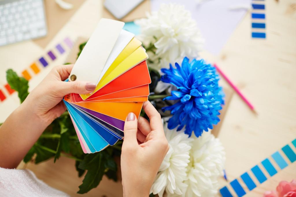
Gray-on-gray furniture felt flat under cool light. The owner reported spending evenings in bed instead of the living area. Friends described the place as tidy yet distant, like a waiting room. The space needed warmth without sacrificing calm.

Real-Home Story: A Studio Transformed with Sage and Terracotta

We introduced a sage loveseat, terracotta pouf, and cream storage bench. Paper swatches taped to drawers guided undertone selection over three days. A small brass lamp warmed reflective highlights. The owner journaled mood changes nightly, noting increased time spent reading.
Spring and Summer Lift
Lighten the room with powder-blue side chairs, pale rattan stools, or a mint rolling cart. Pair with breezy cotton covers on benches. These cool, airy colors psychologically expand space, encouraging open windows, longer mornings, and joyful weekend gatherings.
Autumn and Winter Coziness
Swap in cinnamon accent chairs, olive footstools, and a walnut side table. Layer knit slipcovers on dining seats. These deeper hues narrow visual distance, cocooning conversations. Add warm-white bulbs to complement richer colors and invite slow, firelight-paced evenings.
A Simple Swap Strategy
Designate a color bin for each season containing pillow-top stools, tray tables, and slipcovers. Mark items by palette tags so transitions take minutes, not days. Post your inventory and we’ll help refine a practical, mood-first rotation schedule.

Try-It Toolkit: Swatches, Apps, and Easy Experiments

For seven days, photograph your furniture colors at morning, midday, and evening. Note feelings and activities. Patterns emerge fast, revealing which hues support focus or rest. Share a collage, and we’ll spot undertones affecting your daily rhythms.

Try-It Toolkit: Swatches, Apps, and Easy Experiments

Snap your room and overlay furniture colors in a design app. Compare a navy credenza versus forest green at identical lighting. Look for harmony with flooring and rugs. Post screenshots, and we’ll vote with reasons to sharpen your eye.
Outerformpartners
Privacy Overview

This website uses cookies so that we can provide you with the best user experience possible. Cookie information is stored in your browser and performs functions such as recognising you when you return to our website and helping our team to understand which sections of the website you find most interesting and useful.