
The Influence of Color on the Perception of Space
Chosen theme: Influence of Color on Perception of Space. Explore how hues, values, contrasts, and finishes reshape rooms without moving a single wall—plus practical, human stories you can apply today.
Warm vs. Cool: How Temperature Warps Room Size
01
Cool hues like blue, teal, and soft green recede, making walls feel farther and ceilings higher. In compact rooms, they introduce calm depth without visual clutter, expanding perceived breathing space and encouraging slower, more restful movement.
02
Reds, terracottas, and mustards visually advance, pulling surfaces closer. This compression can be comforting in large, echoing spaces, encouraging conversation and intimacy while adding a tactile, embrace-like quality that makes lounge corners and dining areas feel intentionally gathered.
03
Use warm accents near seating and cool envelopes on perimeters to stretch boundaries while keeping heart zones inviting. Share your plan: which walls get warmth, and where will you let calm blues or greens quietly push the room outward?
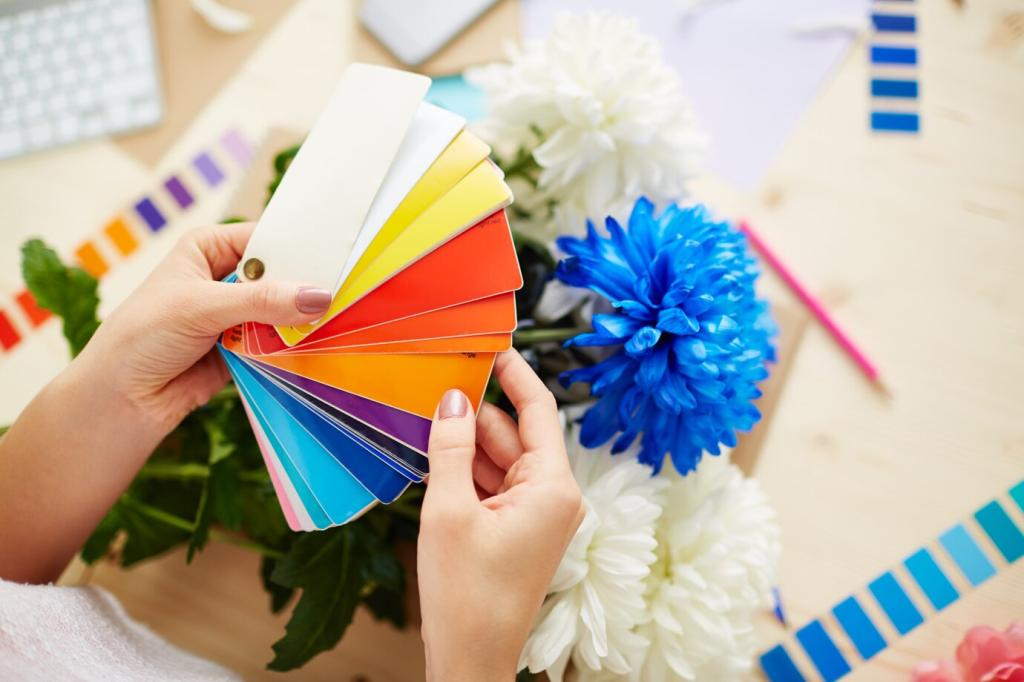
Pale values expand, dark values compress
Light tints bounce more light, softening edges and visually widening surfaces. Darker shades absorb light, bringing planes forward. Try a pale ceiling to loft verticals and a darker floor to anchor, then tell us how your space’s proportions changed.
Saturation controls perceived density
Desaturated hues breathe; saturated hues feel dense and closer. A low-saturation gray-blue can float a wall backward without stealing attention, while a highly saturated emerald creates striking presence. Comment which rooms in your home need lift versus weight.
High contrast tightens contours
Crisp dark-on-light contrasts define edges sharply, making elements feel nearer and more compact. Use this deliberately on cabinetry or door frames when you want architectural punctuation, but soften contrasts if your goal is spatial flow and visual calm.
Low-contrast blends dissolve corners
Painting adjacent walls, trims, and doors in nearly the same value blurs boundaries, letting corners melt away. This trick can stretch narrow rooms, transforming boxy corners into gentle gradients that feel continuous rather than segmented or confined.
Directional accents guide movement
A vertical stripe of deeper tone can pull the eye upward, while a horizontal band can lengthen a wall. In a tight hallway, I used a muted runner-like stripe to suggest length; visitors swore it felt two meters longer.
Finishes and Textures: Reflectance Changes Scale
Matte finishes scatter light, reducing glare and visual noise, which smooths transitions and can make rooms feel broader. Gloss bounces light and sharpens reflections, adding drama but also emphasizing boundaries that may visually compress smaller spaces.
Light Sources and Color Rendering: Space Changes with the Sun
North light cools colors and flattens glare, great for pale blues that expand. West light warms dramatically at sunset, pulling warm walls forward. Track your room hourly and pick hues that maintain your preferred spaciousness across the full day.
Choose bulbs around 2700–3000K for cozy evening expansion or 3500–4000K for balanced clarity. Aim for a high CRI to preserve hue accuracy. Consistency across fixtures prevents patchwork color shifts that fragment rooms and reduce perceived continuity.
Combine ambient, task, and accent lighting to sculpt planes. Wall washers can float verticals outward; dimmers let you swell or compress atmosphere on demand. Post a photo of your lighting layers, and subscribe for more space-shaping lighting strategies.
Culture, Memory, and Personal Bias: Why Color-Space Feels Different
In some contexts, white symbolizes emptiness and vastness; in others, it feels clinical and cold. Earth tones can signal stability or heaviness. Knowing your cultural lens helps you choose colors that stretch space emotionally as well as visually.